
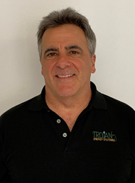
President
I started working a paper route when I was 12 years old — talk about a rough business. I had to get up at 4 a.m. and deliver papers every day, sometimes in two feet of snow and 10 below zero. When other kids were playing, I had to collect for the papers. I made $12 per week.
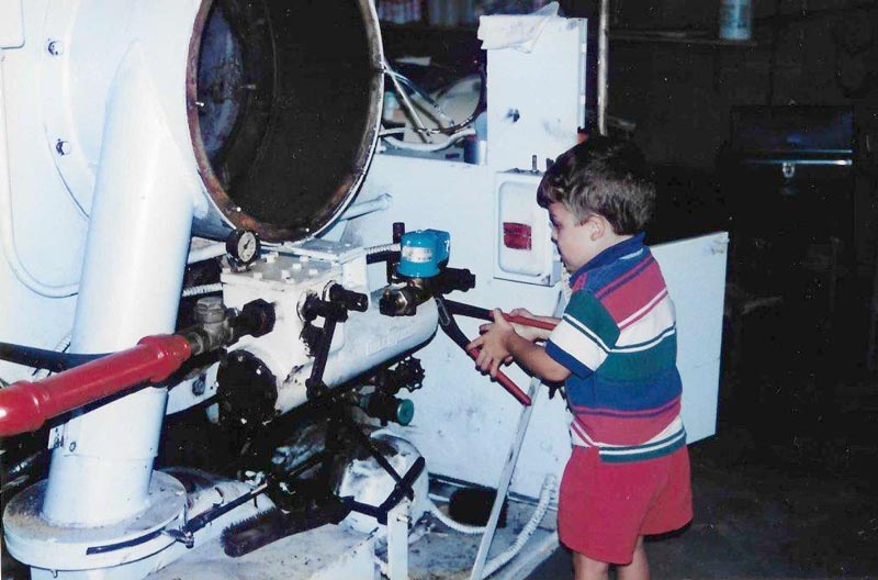
I started in the HVAC business when I was 15 years old and got my working papers. I would clean boilers after school and on weekends. When I got my license, I started going out and servicing boilers and installing heating systems. I attended various trade schools and training seminars related to the boiler and combustion industry.
In 1986, I started managing the heating company I was working for when the owner decided on another business direction. Then I left this company and started my own business: Glenn Godell Mechanical Services. With some help and assistance from a school buddy, we were selling, installing, and billing for our small HVAC business.
In 1990 I stopped GGMS and began a partnership with a larger boiler company. We incorporated Trojan Energy in 1991. Throughout it all, I continued to attend service school training, sales conferences, and trade schools to continue educating myself in the combustion business. Eventually, I purchased all the shares of Trojan Energy from the shareholders in 2005.
Since then, TES has grown to more than 20 employees and we’re still growing. We boast 12 factory-trained technicians, and more than 150 years of combined boiler knowledge and combustion experience. Each technician is working out of a fully stocked service vehicle. We have a fully stocked parts warehouse to support our field services as well as retail sales to our very valued customers. We’ve also built seven mobile boiler rooms.
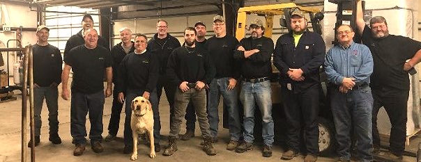
 It’s a family here at Trojan, and not just because my wife, Susan, handles our accounts payable department and general administration. Our business is staffed with people who genuinely care about their work and about our company. My son Jonas is himself one of our factory trained field technicians. And Loki, our Labrador Retriever, never misses a day at the office.
Hard work. Expertise. Family values. Integrity. That’s what’s driven me my whole life: to give my customers unmatched customer service, the most talented techs in the industry, and reliable, excellent work you can count on.
Thanks for visiting Trojan Energy Systems.
Our logo story.
When I first started Trojan Energy Systems, I wanted to communicate strength, trust, reliability, and expertise. With a horse at the center of our logo, I felt confident we had captured the company’s values and, frankly, our personality.
![]()
OLD LOGO
NEW LOGO
In 2020, we decided to revisit our logo and update it to reflect our vision for ourselves and our future over the next five, 10 and 20 years. Part of our mission is to stay innovative and contemporary, and we wanted our logo to communicate that aspect of our business, too. So, we retired our horse in favor of a simple flame.
The colors we chose are associated with environmentalism and trustworthiness. We wanted our clients to know that we’re intent on cutting emissions and saving them money. The flame also includes an ignitor, typically found in boilers, to represent a spark of innovation, drive and power.
And to stand out from the crowd and complement the new logo, we employed an uppercase, customized slab-serif typeface for the larger portion of the brand name, which is approachable and contemporary.